- Creating a data frame
 students = data.frame (
 hours=c(2,3,5,6,8,10,12),
 score=c(50,55,65,70,75,85,90)
 )

 str(students)
‘data.frame’: 7 obs. of 2 variables: score: num 50 55 65 70 75 85 90’data.frame’: 7 obs. of 2 variables: score: num 50 55 65 70 75 85 90
- Summarize the dataframe
summary(students) hours score
Min. : 2.000 Min. :50
1st Qu.: 4.000 1st Qu.:60
Median : 6.000 Median :70
Mean : 6.571 Mean :70
3rd Qu.: 9.000 3rd Qu.:80
Max. :12.000 Max. :90- To get first n records / last n records
# get first 2 records
head(students, 2)
# get last 3 records
tail(students, 3)- To get the 3rd and 5th row , for column 1 and 2
students[c(3,5), c(1,2)] hours score
3 5 65
5 8 75- plotting graphs
plot(students$hours, students$score, main="Study hours vs Exam score",
xlab = "hours studied",
ylab="exam score",
pch=20)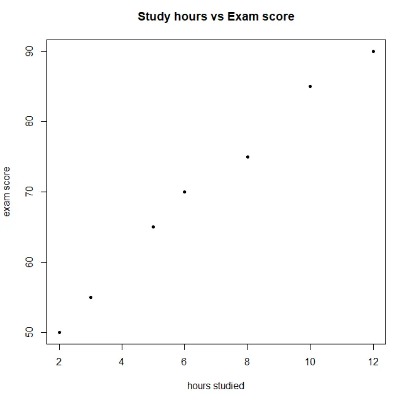
barplot(students$hours, students$score, main="hours studied vs exam score", xlab="hours studied", ylab="exam score")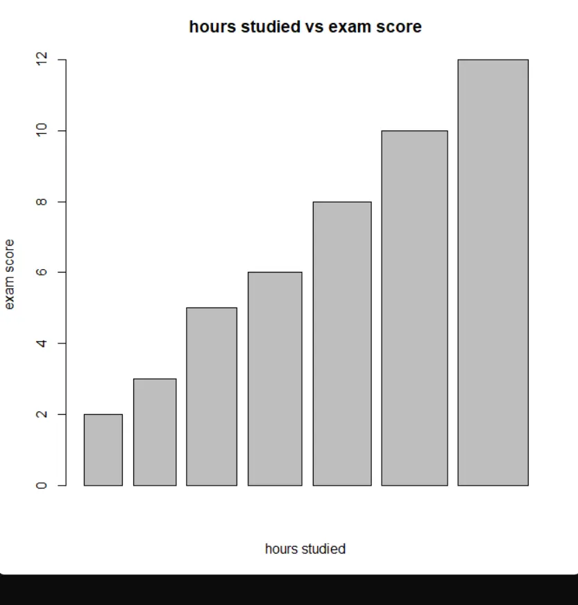
Exercise
find.package('readxl')
library(readxl)
data_file = file.choose()
student_marks = readxl(data_file)
student_marks
# A tibble: 100 × 5
RollNo Maths History Physics Arts
<dbl> <dbl> <dbl> <dbl> <dbl>
1 1 47 9 57 51
2 2 21 78 25 62
3 3 70 45 80 28
4 4 66 42 68 22
5 5 7 35 12 87
6 6 69 29 77 14
7 7 32 74 34 48
8 8 73 3 81 20
9 9 62 80 71 24
10 10 68 41 78 14
# ℹ 90 more rows
# ℹ Use `print(n = ...)` to see more rowsstr(student_marks)tibble [100 × 5] (S3: tbl_df/tbl/data.frame)
$ RollNo : num [1:100] 1 2 3 4 5 6 7 8 9 10 ...
$ Maths : num [1:100] 47 21 70 66 7 69 32 73 62 68 ...
$ History: num [1:100] 9 78 45 42 35 29 74 3 80 41 ...
$ Physics: num [1:100] 57 25 80 68 12 77 34 81 71 78 ...
$ Arts : num [1:100] 51 62 28 22 87 14 48 20 24 14 ...plotting graph
a. Math vs Physics
plot(student_marks$Maths, student_marks$Physics, main="Maths vs Physics", xlab="maths marks", ylab="physics marks")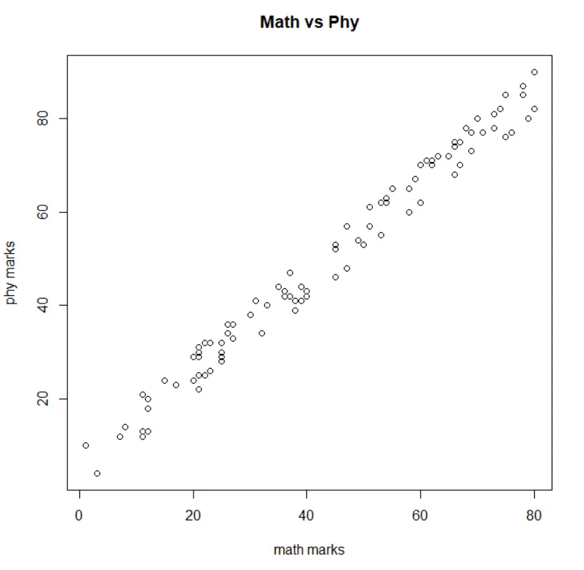
cor(student_marks$Maths, student_marks$Physics)[1] 0.9911593
Thus, High Correlation as Correlation coefficient is close to 1
b. Math vs Arts
plot(student_marks$Maths, student_marks$Arts, main="Maths vs Arts", xlab="maths marks", ylab="Arts marks")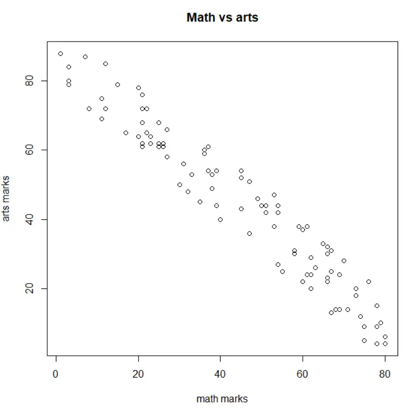
cor(student_marks$Maths, student_marks$Arts)-0.9648045
Negative correlation, as Coefficient of Correlation is close to -1.
c. Math vs Arts
plot(student_marks$Maths, student_marks$History, main="Maths vs History")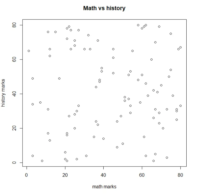
cor(student_marks$Maths, student_marks$History)[1] 0.01833364
thus, No correlation as correlation coefficient is close to 0.
Prediction models
for physics
physics_model = lm
(Physics~Maths, data=student_marks)summary(physics_model)predict(physics_model, data.frame(Maths=c(47,21,70)))1 2 3
53.19789 26.62476 76.70490
   RollNo Maths History Physics  Arts
 1      1    47       9      57    51
 2      2    21      78      25    62
 3      3    70      45      80    28
for history
history_model = lm(History~Maths, data=student_marks)

summary(history_model)

predict(history_model, data.frame(Maths=c(47,21,70)))
1 2 3
41.35981 40.85491 41.80646
- no correlation, thus the predictions don’t make sense
   RollNo Maths History Physics  Arts
 1      1    47       9      57    51
 2      2    21      78      25    62
 3      3    70      45      80    28